Why Does Professional Colour Strategy Matter for Irish Business Websites?
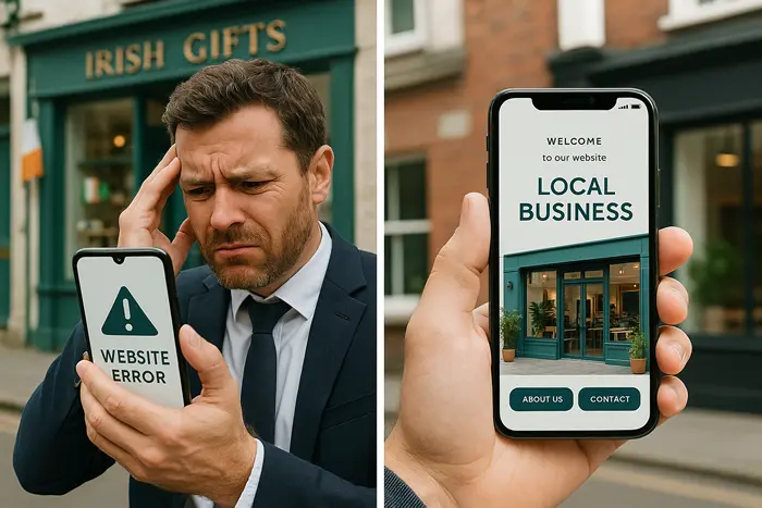
Most Irish businesses spend heavily on advertising, social media, and content. Yet many overlook a fundamental factor that shapes customer trust before a single word is read: colour. Poor choices can undermine credibility and drive potential clients elsewhere, while the right colour strategy creates instant confidence and positions your business as professional.
Why Do Many Irish Businesses Choose the Wrong Colours?
The most common mistake is selecting colours based on personal taste rather than customer perception. A solicitor using playful shades might unintentionally signal inexperience. An accountant choosing vibrant orange could create an impression of creativity when clients actually want stability and precision.
Customers form immediate judgements from visual cues. Colours influence whether a business looks professional or amateur, affordable or premium, trustworthy or risky. Ignoring these associations risks losing visitors before they engage with your services.
Another overlooked element is compliance. The Web Accessibility Initiative (https://www.w3.org/WAI/) sets colour contrast standards that directly affect readability. Failing to meet these requirements can expose Irish businesses to legal complaints and also impact Google rankings.
What Happens When Colour Psychology Is Ignored?
Colour psychology affects user behaviour in measurable ways. Poor choices lead to:
- Professional services losing authority: Light blues suggest junior or budget services, while deep navy conveys experience and premium expertise.
- Healthcare websites creating anxiety: Harsh reds or stark blacks heighten stress. Softer greens and blues promote calm when chosen carefully.
- Financial firms reducing credibility: Flashy greens and yellows can resemble questionable investment schemes. Muted greys and blues imply reliability and fiduciary responsibility.
Research on decision-making from Harvard Business Review (https://hbr.org/topic/decision-making) highlights how such visual signals influence purchasing choices. Applying this understanding within the Irish market requires both design expertise and cultural awareness.
How Do Accessibility Standards Affect Colour Strategy?
Accessibility is not optional. Under EU law, Irish websites must meet standards that protect users with visual impairments, including those with colour blindness. Around 8% of men experience colour vision deficiency, meaning poor colour contrast excludes potential customers.
The Irish Government’s accessibility guidance (https://www.gov.ie/en/publication/8f3b5-accessibility-statement/) outlines obligations businesses cannot ignore. Beyond compliance, accessible colour schemes improve usability for all customers, such as mobile users reading in bright daylight. Google also increasingly considers accessibility when evaluating website quality.
When Should Businesses Invest in Professional Colour Strategy?
Investment in colour planning is justified when a website supports core business goals such as generating leads, sales, or credibility. It is especially necessary if:
- Website traffic is strong but conversions are weak.
- Competition is intense and services are similar.
- Premium clients expect high presentation standards.
- Premium pricing is part of positioning.
- Accessibility compliance is a requirement.
Compared with recurring advertising costs, a professional colour strategy is a one-time investment that supports long-term results.
What Qualities Should You Look for in Colour Strategy Services?
Not every designer has the expertise required. Selection criteria should include:
- Business understanding: Colours must align with customer psychology, not just aesthetic taste.
- Technical knowledge: Correct implementation across devices, print, and digital platforms is essential.
- Systematic documentation: Clear hex codes, contrast guidelines, and usage rules maintain brand consistency.
- Local awareness: Knowledge of Irish business culture ensures choices resonate with the intended audience.
A professional approach balances psychology, accessibility, and technical execution.
## How Is Professional Colour Implementation Delivered?
The process involves:
1. Research and positioning: Industry norms, client expectations, and competitor review.
2. Technical testing: Verification of colour contrast ratios and cross-device visibility.
3. Specification: Exact colour values and usage rules to avoid inconsistency.
4. Testing and refinement: Ensuring colours work across digital and print environments.
5. Documentation: Providing compliance evidence and usage guidelines to protect investment.
This structured approach ensures colours become strategic business tools rather than arbitrary choices.
What Results Can You Expect From Professional Colour Strategy?
Realistic benefits include:
- Immediate improvement in professional credibility.
- Stronger alignment with customer expectations.
- Reduced sensitivity to price competition.
- Enhanced accessibility and SEO performance.
- Long-term consistency through documented standards.
- Legal protection with evidence of compliance.
While search ranking benefits appear gradually, perception and trust improvements are immediate once updated colours are implemented.
## Frequently Asked Questions
**Why not just copy a competitor’s colours?**
Imitating competitors signals lack of originality and may misalign with your audience. Professional planning ensures differentiation within industry norms.
**How often should colour strategies be reviewed?**
Minor updates every 2-3 years and major reviews every 5-7 years are typical, reflecting evolving markets and accessibility standards.
**Will changing colours confuse existing customers?**
Refinements usually strengthen trust rather than weaken it. Professional adjustments enhance perception without alienating clients.
**Do colours matter in B2B contexts?**
Yes. Corporate buyers make high-value decisions and expect professionalism. Weak presentation can eliminate businesses from consideration immediately.
**What if accessibility laws change?**
A well-designed strategy anticipates future requirements and includes documentation showing compliance, reducing risk of penalties.
## What Are the Next Steps for Irish Businesses?
Colour is a decisive factor in customer perception. Assess whether your current scheme positions you competitively, supports accessibility, and reflects your professional objectives. Professional consultation ensures colours work as commercial assets rather than liabilities.
Contact us (/contact-us/) to discuss how a professional colour strategy can strengthen your website’s effectiveness, support compliance, and build lasting credibility.
—
Learning Resources
– Web Accessibility Initiative (https://www.w3.org/WAI/) – Official global accessibility guidance.
– Harvard Business Review – Decision Making (https://hbr.org/topic/decision-making) – Insights on how perception shapes decisions.
– Irish Government Accessibility Guidance (https://www.gov.ie/en/publication/8f3b5-accessibility-statement/) – Legal framework for accessibility in Ireland.
—
Internal Links
– Learn about website maintenance services in Ireland (/website-maintenance-services-in-ireland/).
– Explore our web design services overview (/web-design-services-info/).
– Get in touch via our contact page (/contact-us/).